James's Web Log
A blog created whilst studying Digital Media Arts at the University of Brighton.
Winter Presentations
by James
I’ve reached the end of the first term! In the past two weeks I’ve given two presentations on how my work is going so far, in both cases demonstrating the websites I’ve developed and the process behind them. I took this opportunity to get my story straight and map out the final steps for completing my projects.
For the portfolio website, I’ve recently finished implementing the other rooms of the website so now I have to add a few more webpages & mobile css to the site. I’ve recently converted the source CSS to use the SASS precompiler, meaning I can now use mixins to determine how my CSS scales up. Refactoring the CSS to be mobile first will take some time, so I’m going to keep the site design as simple as possible.
For labyr.in/th/, I didn’t know how I should finish my series of interactions. What symbol or meaning should be at the center of the experience? Luckily, a bit of further reading suggested an answer;
Therefore, a labyrinth is something confusing, but it does not end in a monster’s insides. It ends at the beginning, the place you started from
Patrick Adrian, Labyrinths and their Secrets
This logic appeals to me strongly. With labyrinth patterns drawn on paper, it’s easy to trace to the center and then get distracted, but to trace back is to complete a loop, to undo or unfold a path that has been wound up. I see clear differences here between this form of labyrinth and social media websites.
You start at the top of the feed, and you scroll down, and down, and down… You have hundreds of opportunities to click on other links, and there is no clear stopping point or center. You scroll and click relatively passively; the interactions are expected and predefined, unnoticeable and intuitive to almost being invisible. (These rules only hold when consuming social media passively; we can of course actively choose to only view the top five tweets in our timeline, and then stop, etc).
In contrast, my labyrinth has only one path, often unintuitive. The path is clearly indicated, although I intend to make it confusing (for example, pressing the back arrow may take you forwards). When you arrive at the center of the labyrinth, you will then start working through the interactions you’ve just experienced, but now you’ll be completing them backwards. The center of the labyrinth will be a traditional labyrinth to trace through with your mouse, but the exit of the labyrinth, as is the entrance, will be a single click.
Looking towards next term, I will continue to experiment with different ways of engaging with social media sites and web 2.0. It’s possible adapt existing systems and create our own interactions with them, don’t forget.

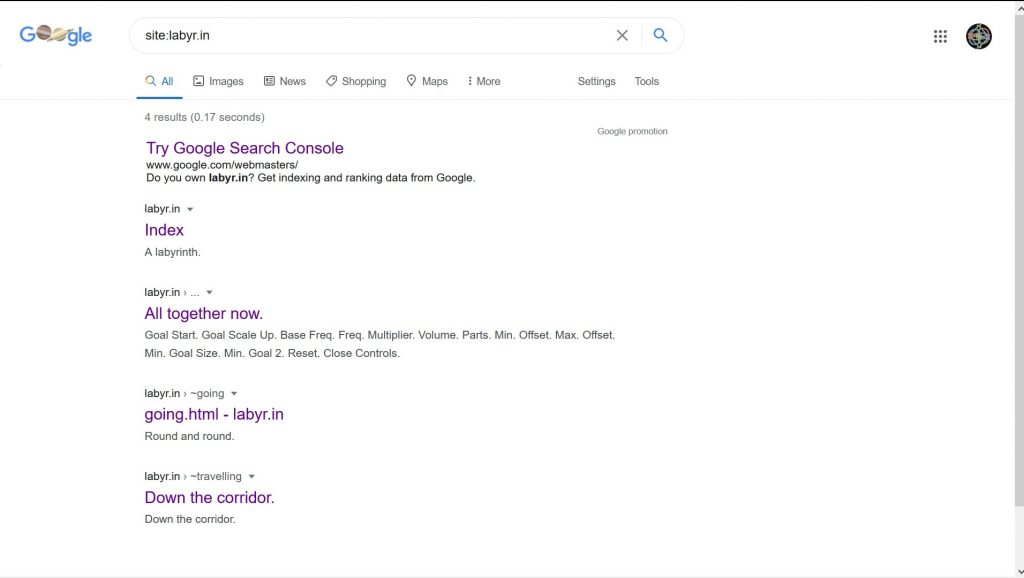
A note regarding labyr.in/th/ – Google’s performance of the site in search results is terrible. This will have to be fixed!
tags: Reflective Writing - Web Projects