James's Web Log
A blog created whilst studying Digital Media Arts at the University of Brighton.
Rainbow Buttons
by James
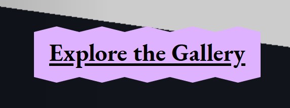
After testing my gallery website with visitors, they often missed the Click to visit gallery button. This is perhaps because they’ve tested this site previously and expect to be able to walk around the gallery immediately, as they are used to. However, I acknowledge that the button is rather obscure. To remedy this, I gave the button a rainbow background, made its text larger and gave it a fancy spiky border.

The technique for implementing the rainbow background was inspired by Robin Sloan’s website, I reused the spikey border hover effect from a previous project. It’s fun to add these offbeat design elements into the website, it gives the site a bit more character.
On reflection, the button starts to be a bit too distracting; I now only show the rainbow effect on hover. And I’ll reduce the font size a bit!
For the rest of the portfolio site, I want to keep things uncluttered and simple. This saves development time and builds my brand image. I like the idea of reducing online noise if possible (as well as offering the alternative online experience that is a 3D gallery).
========
An idea that resonated with me this week…
tags: Reading - Reflective Writing - Web Projects“(Internet art) is art because it incorperates the internet with an original idea and authentic message, it changes the perpsective from which we see usual things such as a browser page or social networks… this is what artists alway do: they experiment with reality and question whats taken for granted.” From the Armchair Art Historian’s YouTube Channel