James's Web Log
A blog created whilst studying Digital Media Arts at the University of Brighton.
Web 2.0 Disruptions
by James
“The internet just feels like this giant mall, there’s gotta be more to it”
Tech Critic on The Social Dilemma, a Netflix documentary about how Netflix is ruining our lives.
From the previous blog post… “Could we create art through deliberately setting context in exaggerated forms, so that the content is percieved in a new light?” A simple way of doing this is to modify the web browser DOM with some extra CSS styling. You can copy and paste the following code into your browser JavaScript debugger to create a range of striking effects.
//Rotates all webpage elements randomly.
let elements = document.getElementsByTagName("*");
for (let i = 0; i < elements.length; i++) {
  let randomNumber = (Math.random()*60 - 30).toString();
  elements[i].style.transform = "rotate(" + randomNumber + "deg)";
}
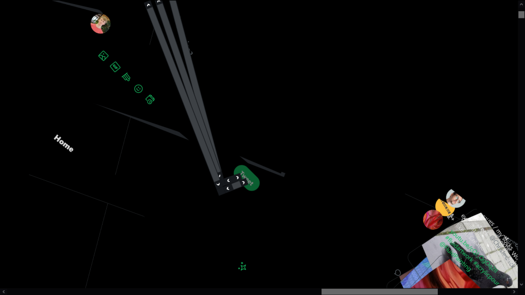
 Twitter, Tilted
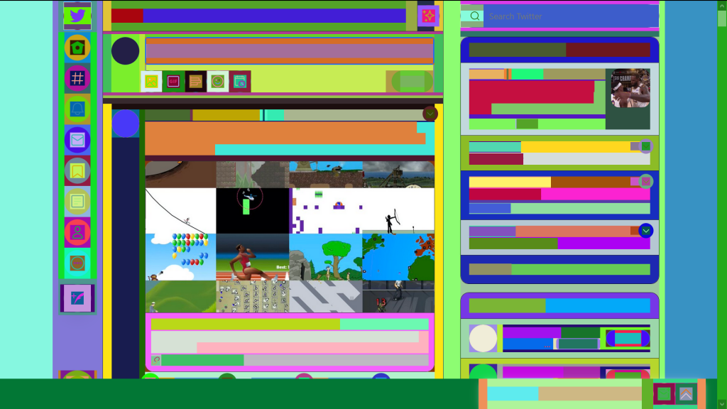
 Twitter, Colourised
I’m having a go at creating a web browser extension to apply these effects automatically on visiting a website. As we make a mess of the Twitter brand, our attention is brought to the invisible gallery that the Web 2.0 exists within. The forms of content distribution, once we become familiar to their patterns of scrolling and clicking, are lost as the background of the endless stream of content and information passing through. This doesn’t have to be the case however; here’s a more theoretical collection of CodePen demos where form is more important than content.
Web 2.0 Dependencies
This CodePen demo displays the wrapper code that normally holds the CodePen demo. There is no source code visible in the demo itself.
See the Pen Web 2.0 Dependencies by James Hancock (@jhancock532) on CodePen.
When viewed in different contexts and by different browser agents, different code is logged into the <textarea>. This makes me think of how digital art is always performed…
“The visualisation of digital data is always an act of interpretation by the internet user”
Groys 2016, pp.142–146
Groys goes on to explan that the data file is the art, and each web browser performs it in a different way.
In this case, the performance of the file, the framework for hosting and displaying data provided by CodePen, makes up the majority of the art itself, just as Alpha displays the surrounding context and community within which it exists (Hazmus, 2020).
Web 2.0 Performance
This demo infinitely recurses, an embed embedded in an embed. There is nothing but form.
See the Pen Web 2.0 Performance by James Hancock (@jhancock532) on CodePen.
Abusing Customisations Allowed by Web 2.0
Push the limits of the system with a 50 character long YouTube channel name, or just dump a mess of glitch text into the text submission box. Try using qwerty.dev to play with a range of 🅕🅐🅝🅒🅨 𝕗𝕠𝕟𝕥 tools.
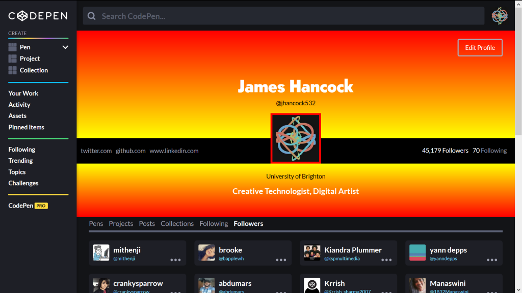
We’re dancing within the constraints of the system, trying to push and break the brand limitations, the dictatorship of the brand asthetic. Surprisingly, CodePen is remarkably open to users doing this. You can customise the CSS of your profile page extensively…

You’ll notice that I have 45, 179 followers. We trust Twitter and Instagram to report the number of followers of each account accurately. However, on CodePen, you also have to trust and verfiy that I haven’t modified this number with my custom CSS styling. If you’re unaware that the option for custom styling exists you might be easily misled.
To do this for yourself, fork my source code then include a link to your forked pen on the profile settings page.
References
Groys, B., 2016. In The Flow. 2nd ed. London: Verso, p.1.
tags: Reading