James's Web Log
A blog created whilst studying Digital Media Arts at the University of Brighton.
Virtual Architecture Incorperated
by James
Web development has never felt so strange – the entire focus of the project is utilising and styling 3D space. Plenty of design choices to be made! Here’s my working so far…
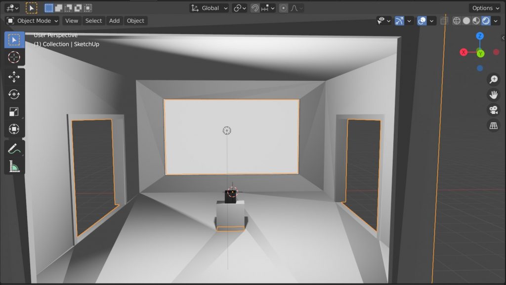
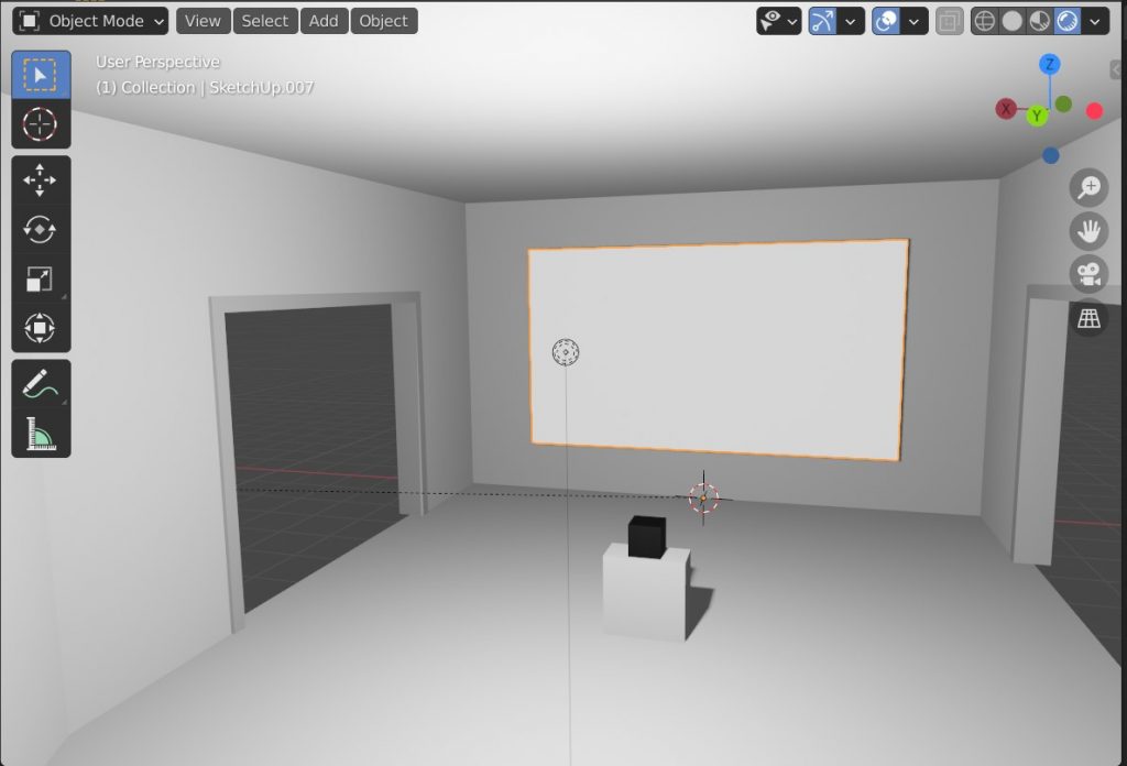
Due to the constrictive nature of lockdown, I’ve chosen to make my gallery as open and airy as possible – this makes a nice change from the cramped living conditions that are typical for student accomodation. Due to the content heavy nature of the internet, I’ve chosen to showcase only one piece of artwork per room, hoping to avoid content overload syndrome. The main room of the gallery has the projector box placed at the center of the space; I like having its presence highlighted, I like the idea of revealing the system that supports the scene. This is why I’ve added a window to the back of the gallery room – a window looking out into nothingness, the black void of the rendering engine!
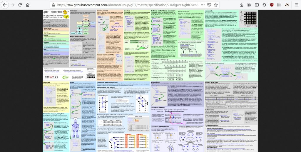
 I’m loading my model via the .glTF file format – the above is the file format specification, I scanned over this to learn about my limitations / creative license whilst modelling.
From the above I wasted an hour trying to load in a normal map to make the wall textures look more painted. I’ll return to this later.
 This isn’t what the normal map is supposed to look like.
Much more successful was adding the emission texture via tweaking a material.
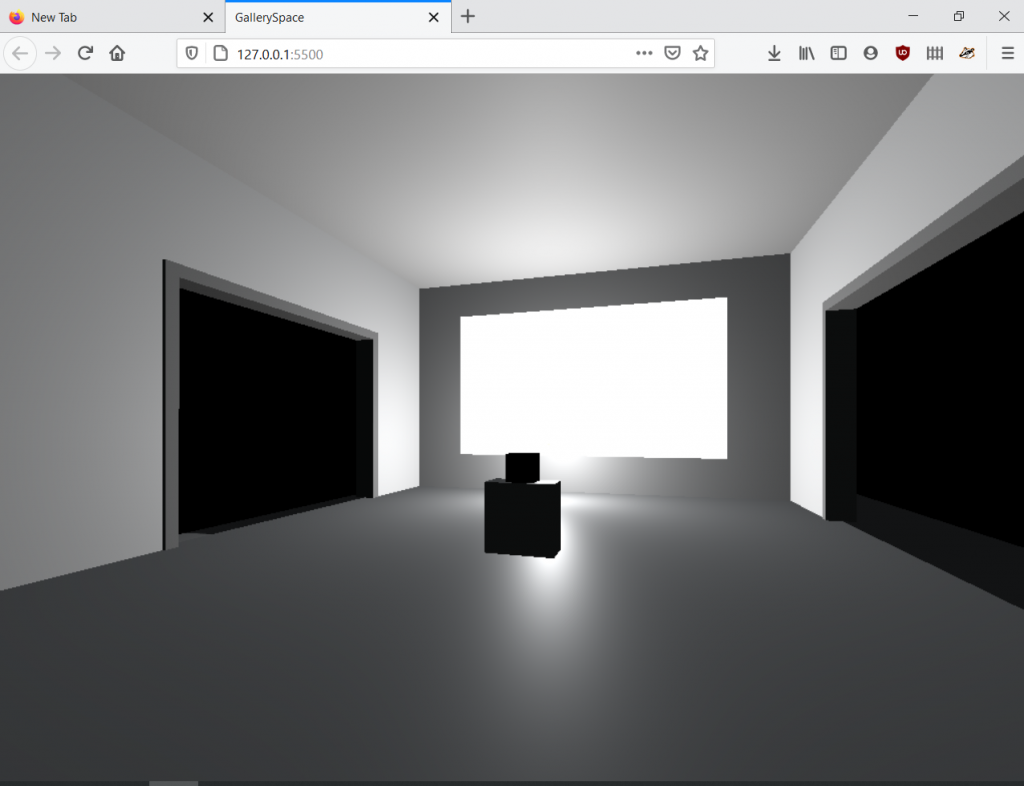
 I added emission to the projector throw space so it renders brightly.
Finally, I loaded the scene and added basic PointerLockControls for the camera movement system. Next week I’ll be making the site live on GitHub Pages so you can play with it yourself – until then, plenty of thought needs to go into gallery layout…
 And the lighting system, and making textures less shiny, and…