James's Web Log
A blog created whilst studying Digital Media Arts at the University of Brighton.
Metadata, 3D Text
by James
3D text is relatively easy to add in Three.js. I had some fun adding ridiculously large text whilst playing around, I think it distrubs the stuffy gallery feel quite nicely (at a cost of becoming an “alternative” gallery).
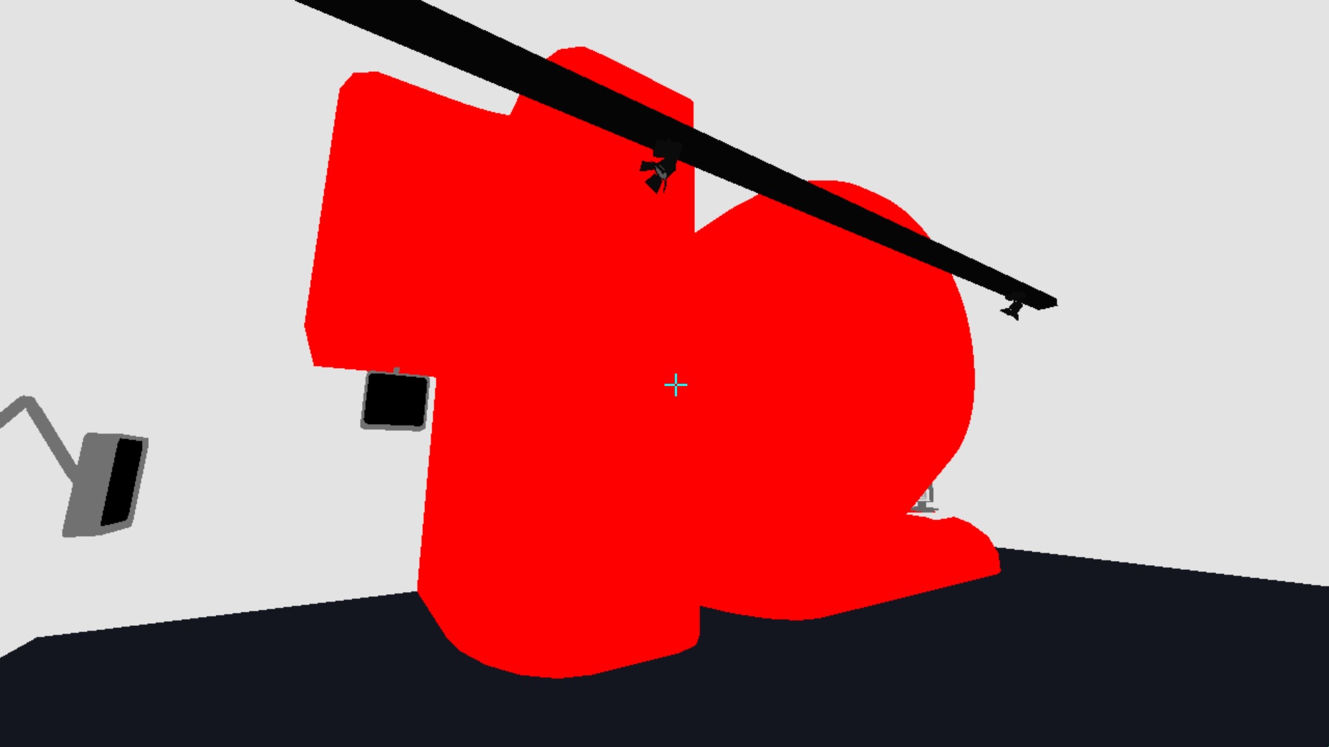
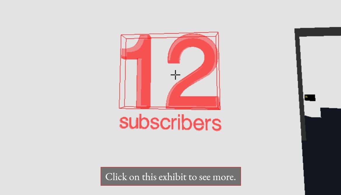
I’ve added a subscriber count to poke fun at my gallery and return the context of my digital work to its authentic origins - at the moment, I am a nobody. This is ok.
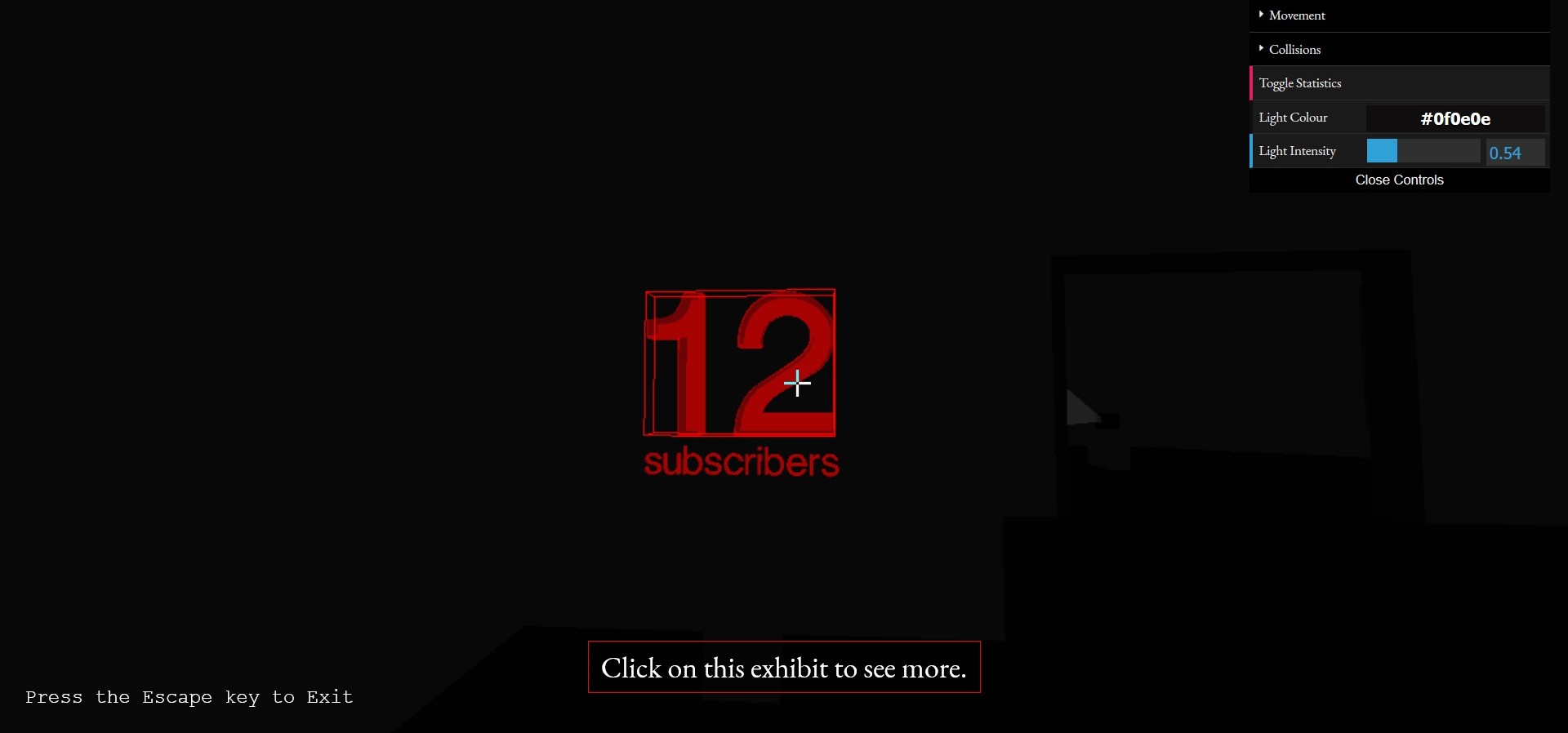
I’ve added a message and a cursor to help users navigate and exit the site. You can now also control the lighting of the gallery via a colour picker (this helped me debug the default light settings).
I’ve had a go at adding a favicon to the site, it took me a few iterations to get a logo I was happy with. In the end I settled with the Helm Symbol, aka the Control Key - ⎈. Quite an obscure symbol, but it returns a few interesting YouTube videos when you put it into YouTube’s search algorithm.
In an early iteration of the logo, I played with the fact that dark browsers would only show white favicon details, and light browsers only black. Sadly I’m not that interested in designing a logo that would look good in both these contexts, so I’ll leave this idea for later.
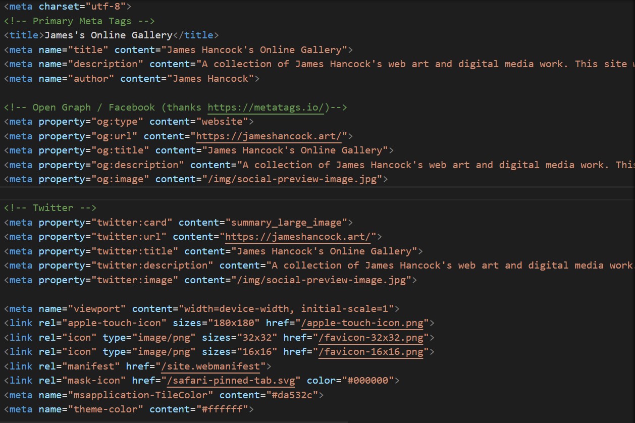
I’ve added some social media preview images as well. Pitching the metadata of the site is important for how I want the site to display across the internet, a key part of web art in the era of Web 2.0. Remember, the majority of visitors to your webpage could be bots. Play to your audience.
I’ve chosen the below image for social media - a nice photo of the gallery interior. ‘Wish you were here’ style.
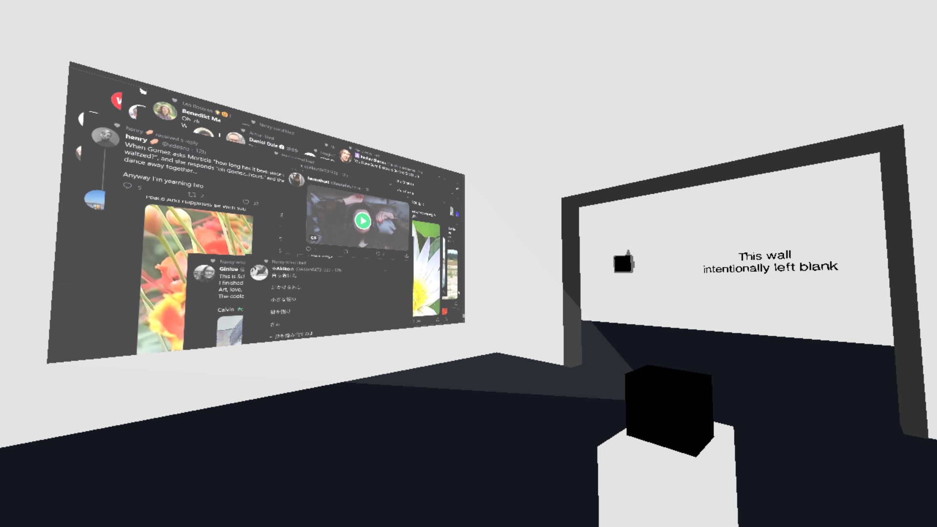
I’ve noticed that the Twitter and Graph meta data urls can be distinct to the actual URL of the webpage. This is an opportunity for a collaborative web art experiment; This site has been hijacked! Please navigate to the below URL instead!
Feedback on the site has been helpful, I now give the visitor new tabs when they view the gallery exhibits. Before they had to re-enter the gallery each time they clicked a link, which isn’t a pleasant user experience.
tags: Reflective Writing - Web Projects